1. Load packages and cleaned dataset
library(tidyverse)
library(data.table)
library(viridis)
library(ggpubr)
all_trips_cleaned <- fread("C:\\Users\\izzyl\\Documents\\Portfolio\\01. Cyclistic\\03. Analysis\\01-03-03 all_trips_cleaned.csv")2. Most popular stations
library(leaflet)
library(htmlwidgets)
library(htmltools)

# Create a data frame which groups number of trips by station name and includes latitude and longitude coordinates for each station
map_data <- all_trips_cleaned %>%

  select(
    start_station_name,
    start_lat,
    start_lng
    ) %>%

  group_by(
    start_station_name
    ) %>%

  mutate(
    numtrips = n()
    ) %>%

  distinct(
    start_station_name,
    .keep_all = TRUE
    )

# Create a sequence of values which will act as the key shown on the leaflet map to group stations which have a similar number of trips occurring together
mybins <- seq(0, 70000, by = 10000)

# Assign the viridis colour palette to visually show how popular a station is
mypalette <- colorBin(
  palette ="viridis",
  domain = map_data$numtrips,
  na.color = "transparent",
  bins = mybins
  )

# Prepare text to be used in a tooltip so that users can interact with the coloured markers on the map
mytext <- paste(
  "Station name: ", map_data$start_station_name, "<br/>",
  "Number of trips: ", map_data$numtrips, sep = ""
  ) %>%
  lapply(htmltools::HTML)
# Create an interactive html leaflet widget to show the most popular stations
p1 <- leaflet(map_data) %>%
addTiles() %>%
# Set coordinates over the city of Chicago
setView(
lng = -87.6298, lat = 41.8781, zoom = 11.5
) %>%
# Set map style
addProviderTiles("Esri.WorldGrayCanvas") %>%
# Add circle markers to represent each station
# & add a fill colour to show the popularity of each station
# & add an interactive tooltip for detail
addCircleMarkers(
~ start_lng, ~ start_lat,
fillColor = ~ mypalette(numtrips),
fillOpacity = 0.7,
color = "white",
radius = 8,
stroke = FALSE,
label = mytext,
labelOptions = labelOptions(
style = list(
"font-weight" = "normal",
padding = "3px 8px"
),
textsize = "13px",
direction = "auto"
)
) %>%
# Add a legend
addLegend(
pal = mypalette,
values = ~ numtrips,
opacity = 0.9,
title = "Number of trips",
position = "bottomright"
)p1 3. Most popular time of year
# Arrange weekdays in order
all_trips_cleaned$day_of_week <- ordered(
  all_trips_cleaned$day_of_week,
  levels = c(
    "Monday", "Tuesday", "Wednesday", "Thursday",
    "Friday", "Saturday", "Sunday"
    )
  )

# Create data frame that summarises the number of trips by date
heat_map_data <- all_trips_cleaned %>%

  select(
    YMD,
    day_of_week,
    week,
    year
    ) %>%

  group_by(
    YMD
    ) %>%

  mutate(
    numtrips = n()
    ) %>%

  distinct(
    YMD,
    .keep_all = TRUE
    )
# Create a heat map to show most popular time of year
p2 <- ggplot(
heat_map_data,
aes(
x = week,
y = day_of_week,
fill = numtrips
)
) +
# Use the viridis colour scheme to show the popularity of each day
scale_fill_viridis(
option = "D",
direction = 1,
name = "Number of trips"
) +
# Create a rectangular heat map
geom_tile(
colour = "white",
na.rm = FALSE
) +
# Separate the heat maps by year
facet_wrap(
"year",
ncol = 1
) +
# Reverse the y-axis so that the weekdays read vertically Monday to Sunday
scale_y_discrete(
limits = rev
) +
# Add x-axis labels to show the months of the year
scale_x_continuous(
expand = c(0, 0),
breaks = seq(1, 52, length = 12),
labels = c("Jan", "Feb", "Mar", "Apr", "May", "Jun",
"Jul", "Aug", "Sep", "Oct", "Nov", "Dec")
) +
# Set the light theme
theme_light() +
# Remove any unnecessary labels
theme(
axis.title = element_blank()
)p2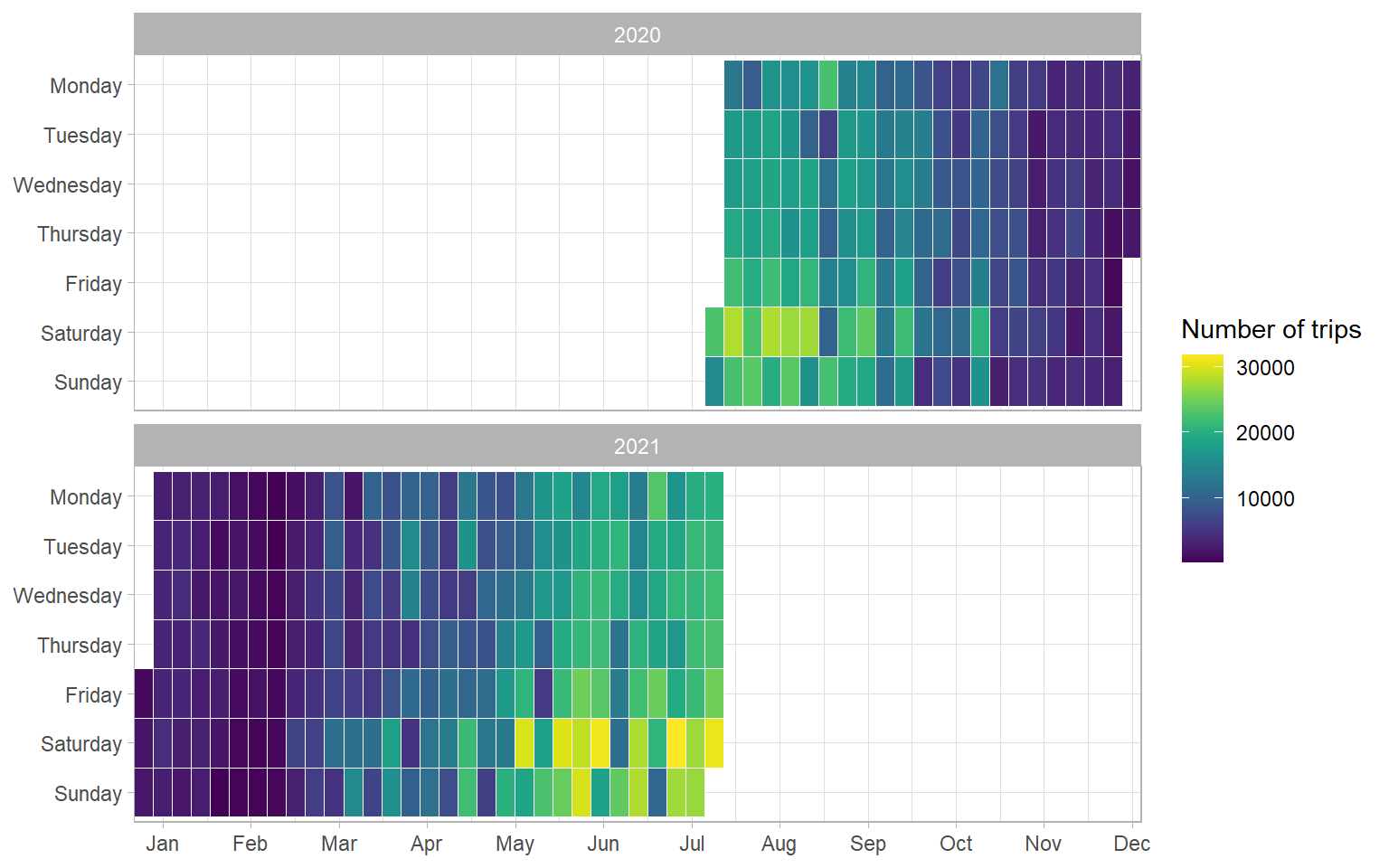
# Create a data frame that summarises the number of trips by date and the rider membership
heat_map_data_mem_cas <- all_trips_cleaned %>%

  select(
    YMD,
    day_of_week,
    week,
    year,
    member_casual,
  ) %>%

  group_by(
    member_casual,
    YMD
  ) %>%

  mutate(
    numtrips = n()
  ) %>%

  distinct(
    YMD,
    member_casual,
    .keep_all = TRUE
  )

# Create a data frame for member riders only
mem_filter_heat_map <- heat_map_data_mem_cas %>%
  filter(member_casual == "member")

#Create a data frame for casual riders only
cas_filter_heat_map <- heat_map_data_mem_cas %>%
  filter(member_casual == "casual")
# Create a heat map to show most popular time of year for members
p2a_member <- ggplot(
mem_filter_heat_map,
aes(
x = week,
y = day_of_week,
fill = numtrips
)
) +
# Use the viridis colour scheme to show the popularity of each day
scale_fill_viridis(
option = "D",
direction = 1,
name = "Number of trips"
) +
# Create a rectangular heat map
geom_tile(
colour = "white",
na.rm = FALSE
) +
# Separate the heat maps by year
facet_wrap(
"year",
ncol = 1
) +
# Reverse the y-axis so that the weekdays read vertically Monday to Sunday
scale_y_discrete(
limits = rev
) +
# Add x-axis labels to show the months of the year
scale_x_continuous(
expand = c(0, 0),
breaks = seq(1, 52, length = 12),
labels = c("Jan", "Feb", "Mar", "Apr", "May", "Jun",
"Jul", "Aug", "Sep", "Oct", "Nov", "Dec")
) +
# Set the light theme
theme_light() +
# Remove any unnecessary labels
theme(
axis.title = element_blank()
) +
# Add a title
labs(title = "Member Riders") # Create a heat map to show most popular time of year for casual riders
p2a_casual <- ggplot(
cas_filter_heat_map,
aes(
x = week,
y = day_of_week,
fill = numtrips
)
) +
# Use the viridis colour scheme to show the popularity of each day
scale_fill_viridis(
option = "D",
direction = 1,
name = "Number of trips"
) +
# Create a rectangular heat map
geom_tile(
colour = "white",
na.rm = FALSE
) +
# Separate the heat maps by year
facet_wrap(
"year",
ncol = 1
) +
# Reverse the y-axis so that the weekdays read vertically Monday to Sunday
scale_y_discrete(
limits = rev
) +
# Add x-axis labels to show the months of the year
scale_x_continuous(
expand = c(0, 0),
breaks = seq(1, 52, length = 12),
labels = c("Jan", "Feb", "Mar", "Apr", "May", "Jun",
"Jul", "Aug", "Sep", "Oct", "Nov", "Dec")
) +
# Set the light theme
theme_light() +
# Remove any unnecessary labels
theme(
axis.title = element_blank()
) +
# Add a title
labs(title = "Casual Riders") # Combine the members only and casual riders only heat maps into one with one common legend
p2a <- ggarrange(
p2a_member,
p2a_casual,
ncol = 1,
nrow = 2,
common.legend = TRUE,
legend = "right"
)p2a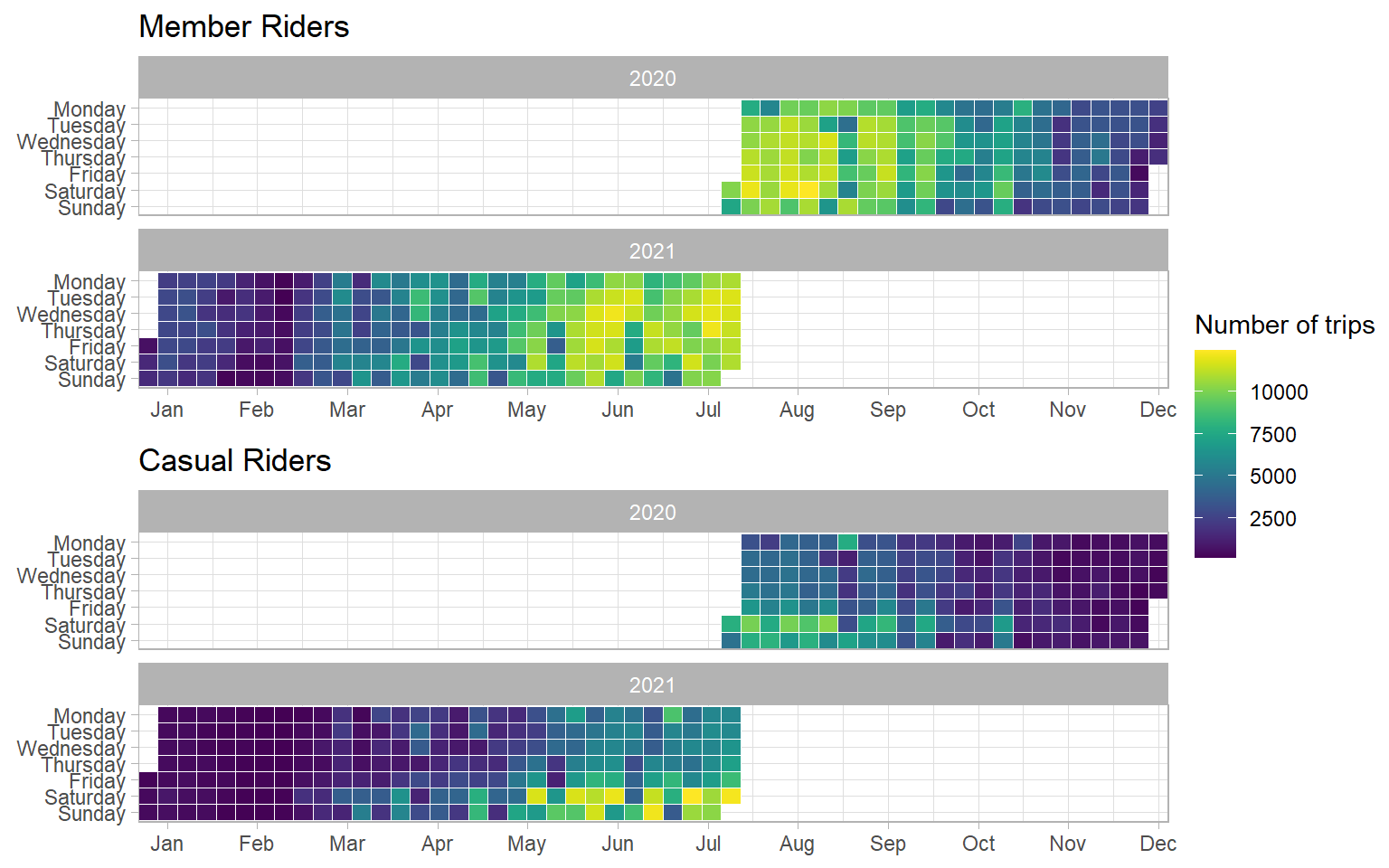
4. Most popular time of day
# Convert the time of day variable to a date format
all_trips_cleaned$ToD_convert <- as.POSIXct(all_trips_cleaned$ToD, format = "%H:%M:%S")

# Group the time variable by hours
all_trips_cleaned$by60 <- cut(
  all_trips_cleaned$ToD_convert,
  breaks = "60 mins"
  )

# Create data frame which counts the number of trips per hour for casual and member riders
circular_bar_chart_data <- all_trips_cleaned %>%

  group_by(
    by60,
    member_casual
  ) %>%

  mutate(
    numtrips_0000s = (n()/1000)
  ) %>%

  distinct(
    by60,
    member_casual,
    numtrips_0000s
  )
# Create a circular bar chart to show the popularity of each hour
p3 <- ggplot(circular_bar_chart_data) +
# Make custom panel grid
geom_hline(
aes(yintercept = y),
data.frame(y = c(0:4) * 125),
color = "lightgrey"
) +
# Create a stacked bar char
geom_bar(
aes(
x = by60,
y = numtrips_0000s,
fill = member_casual
),
stat="identity"
) +
# Create circular shape which starts in the mid-line
coord_polar(start = -0.135, direction = 1) +
ylim(-600, 500) +
# Add x-axis labels
annotate(
x = 1,
y = -50,
label = "00:00",
geom = "text",
size = 2,
) +
annotate(
x = 2,
y = -50,
label = "01:00",
geom = "text",
size = 2,
) +
annotate(
x = 3,
y = -50,
label = "02:00",
geom = "text",
size = 2,
) +
annotate(
x = 4,
y = -50,
label = "03:00",
geom = "text",
size = 2,
) +
annotate(
x = 5,
y = -50,
label = "04:00",
geom = "text",
size = 2,
) +
annotate(
x= 6,
y=-50,
label = "05:00",
geom = "text",
size = 2,
) +
annotate(
x = 7,
y = -50,
label = "06:00",
geom = "text",
size = 2,
) +
annotate(
x = 8,
y = -50,
label = "07:00",
geom = "text",
size = 2,
) +
annotate(
x = 9,
y = -50,
label = "08:00",
geom = "text",
size = 2,
) +
annotate(
x = 10,
y = -50,
label = "09:00",
geom = "text",
size = 2,
) +
annotate(
x = 11,
y = -50,
label = "10:00",
geom = "text",
size = 2,
) +
annotate(
x = 12,
y = -50,
label = "11:00",
geom = "text",
size = 2,
) +
annotate(
x = 13,
y = -50,
label = "12:00",
geom = "text",
size = 2,
) +
annotate(
x = 14,
y = -50,
label = "13:00",
geom = "text",
size = 2,
) +
annotate(
x = 15,
y = -50,
label = "14:00",
geom = "text",
size = 2,
) +
annotate(
x = 16,
y = -50,
label = "15:00",
geom = "text",
size = 2,
) +
annotate(
x = 17,
y = -50,
label = "16:00",
geom = "text",
size = 2,
) +
annotate(
x = 18,
y = -50,
label = "17:00",
geom = "text",
size = 2,
) +
annotate(
x = 19,
y = -50,
label = "18:00",
geom = "text",
size = 2,
) +
annotate(
x = 20,
y = -50,
label = "19:00",
geom = "text",
size = 2,
) +
annotate(
x = 21,
y = -50,
label = "20:00",
geom = "text",
size = 2,
) +
annotate(
x = 22,
y = -50,
label = "21:00",
geom = "text",
size = 2,
) +
annotate(
x = 23,
y = -50,
label = "22:00",
geom = "text",
size = 2,
) +
annotate(
x = 24,
y = -50,
label = "23:00",
geom = "text",
size = 2,
) +
# Annotate y-axis scaling labels
annotate(
x = 24,
y = 125,
label = "125,000",
geom = "text",
size = 2.5,
angle = 15
) +
annotate(
x = 24,
y = 250,
label = "250,000",
geom = "text",
size = 2.5,
angle = 15
) +
annotate(
x = 24,
y = 375,
label = "375,000",
geom = "text",
size = 2.5,
angle = 15
) +
annotate(
x = 24,
y = 500,
label = "500,000 trips",
geom = "text",
size = 2.5,
angle = 15
) +
# Use viridis colour scheme
scale_fill_viridis_d() +
# Set light theme
theme_light() +
# Remove unnecessary labels
theme(
axis.title = element_blank(),
axis.ticks = element_blank(),
axis.text = element_blank(),
legend.position = "bottom",
legend.title = element_blank(),
)p3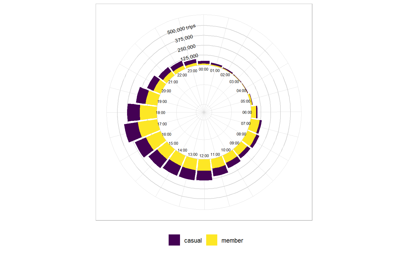
5. Weather impact
# Load raw weather data
raw_weather <- fread("C:\\Users\\izzyl\\Documents\\Portfolio\\01. Cyclistic\\02. Raw Data\\2710187.csv")

# Organise weather data by average temperature, average precipitation and average wind speed for each date.
weather_organised <- raw_weather %>%

  group_by(DATE) %>%

  summarise(
    ave_temp = mean(TAVG, na.rm = TRUE),
    ave_precip = mean(PRCP, na.rm= TRUE),
    ave_wind_speed = mean(AWND, na.rm = TRUE)
    )

# Create a data frame which tabulates the number of trips each day for casual riders
casual <- all_trips_cleaned %>%

  group_by(
    YMD,
    member_casual
    ) %>%

  filter(
    member_casual == "casual"
    ) %>%

  summarise(
    numtrips_casual = n()
    )

# Create a data frame which tabulates the number of trips each day for members
member <- all_trips_cleaned %>%

  group_by(
    YMD,
    member_casual
    ) %>%

  filter(
    member_casual == "member"
    ) %>%

  summarise(
    numtrips_member = n()
    )

# Merge the casual and member data frames into one
cas_mem <- merge(
  casual,
  member,
  by = "YMD"
  )

# Change the YMD string type to character string to avoid timezone conversion mistakes
cas_mem <- cas_mem %>%
  mutate(
    YMD = as.character(YMD)
    )

# Set the primary linking key (the date) in the weather data frame to YMD to match the cas_mem data frame
weather_organised <- weather_organised %>%

  mutate(
    DATE = as.character(DATE)
    ) %>%

  rename(YMD = DATE)

# Merge the weather data and cas_mem data frames into one
merged <- merge(
  weather_organised,
  cas_mem,
  by = "YMD"
  )
#1. Plot average temperature vs number of trips per day
ave_temp <- ggplot(
merged,
aes(
y = ave_temp
)
) +
# Create scatter points
geom_point(
aes(
x = numtrips_casual,
color = "Casual"
),
alpha = 0.5
) +
geom_point(
aes(
x = numtrips_member,
color = "Member",
),
alpha = 0.5
) +
# Add title and axis labels
labs(
title = "Average temperature vs no. of trips",
y = "Average temperature (F)",
x = "Number of trips"
) +
#Use viridis colour scheme
scale_color_viridis_d() +
# Set light theme
theme_light() +
# Remove legend title and center title
theme(
legend.title = element_blank(),
plot.title = element_text(hjust = 0.5)
)
# 2. Plot average wind speed vs number of trips per day
ave_wdspd <- ggplot(
merged,
aes(
y = ave_wind_speed
)
) +
# Create scatter points
geom_point(
aes(
x = numtrips_casual,
color = "Casual"
),
alpha = 0.5
) +
geom_point(
aes(
x = numtrips_member,
color = "Member",
),
alpha = 0.5
) +
# Add title and axis labels
labs(
title = "Average wind speed vs no. of trips",
y = "Average wind speed (mph)",
x = "Number of trips"
) +
#Use viridis colour scheme
scale_color_viridis_d() +
# Set light theme
theme_light() +
# Remove legend title and center title
theme(
legend.title = element_blank(),
plot.title = element_text(hjust = 0.5)
)
# 3. Plot average precipitation vs number of trips per day
ave_precip <- ggplot(
merged,
aes(
y = ave_precip
)
) +
# Create scatter points
geom_point(
aes(
x = numtrips_casual,
color = "Casual"
),
alpha = 0.5
) +
geom_point(
aes(
x = numtrips_member,
color = "Member",
),
alpha = 0.5
) +
# Add title and axis labels
labs(
title = "Average precipitation vs no. of trips",
y = "Average precipitation (inches)",
x = "Number of trips"
) +
#Use viridis colour scheme
scale_color_viridis_d() +
# Set light theme
theme_light() +
# Remove legend title and center title
theme(
legend.title = element_blank(),
plot.title = element_text(hjust = 0.5)
)
# Combine all 3 plots into one
p4 <- ggarrange(
ave_temp,
ave_precip,
ave_wdspd,
ncol = 2,
nrow = 2,
common.legend = TRUE,
legend = "bottom"
)p4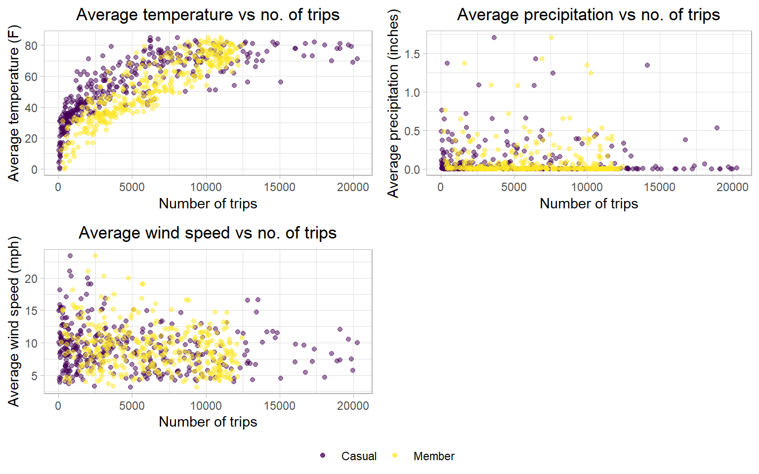
6. Statistic summary
# Create function which calculates mode
getmode <- function(v) {
  uniqv <- unique(v)
  uniqv[which.max(tabulate(match(v, uniqv)))]
}

# Create a data frame which summarises the all_trips_cleaned dataset by important variables
statistic_summary <- all_trips_cleaned %>%

  group_by(
    member_casual
  ) %>%

  summarize(
    ave_ride_length_mins = (mean(ride_length, na.rm = TRUE))/60,
    mode_day_of_week = getmode(day_of_week),
    mode_month = getmode(month),
    mode_time_of_day = getmode(ToD),
    ave_time_of_day = format(mean(ToD_convert, na.rm = TRUE), "%H:%M:%S")
) kable(head(statistic_summary))| member_casual | ave_ride_length_mins | mode_day_of_week | mode_month | mode_time_of_day | ave_time_of_day |
|---|---|---|---|---|---|
| casual | 37.62571 | Saturday | 7 | 17:19:15 | 15:11:39 |
| member | 14.38970 | Wednesday | 8 | 17:20:37 | 14:32:12 |